flutter移动开发常用
flutter移动开发常用
获取状态栏高度
import "dart:ui";
MediaQueryData.fromWindow(window).padding.top;

/// ToolBar的高度
const double kToolbarHeight = 56.0;

/// 底部导航栏的高度
const double kBottomNavigationBarHeight = 56.0;

/// 包含文本的标签栏的高度
const double kTextTabBarHeight = 48.0;
设置沉浸式状态栏
import 'dart:io';
import 'package:flutter/services.dart';

void main() {
  runApp(MyApp());
  if (Platform.isAndroid) {
    SystemUiOverlayStyle systemUiOverlayStyle =
        SystemUiOverlayStyle(statusBarColor: Colors.transparent);
    SystemChrome.setSystemUIOverlayStyle(systemUiOverlayStyle);
  }
}
APP设置横屏
void main() {
  WidgetsFlutterBinding.ensureInitialized();
  SystemChrome.setPreferredOrientations(
      [DeviceOrientation.landscapeLeft, DeviceOrientation.landscapeRight]);
  runApp(MyApp());
}
渐变标题栏
Scaffold(
    extendBodyBehindAppBar: true,   // 将body至于Appbar下
    appBar: AppBar(
        flexibleSpace: Container(
            decoration: BoxDecoration(
                gradient: LinearGradient(
                    colors: [
                        Color(0xffc2e59c),
                        Color(0xff64b3f4),
                    ],
                    begin:  Alignment.topLeft,
                    end:  Alignment.bottomRight,
                )
            ),
        ),
        // 设置AppBar形状
        shape: RoundedRectangleBorder(
          borderRadius: BorderRadius.vertical(bottom: Radius.circular(40)),
        ),
    ),
)
设置底部虚拟按键颜色
import 'dart:io';
import 'package:flutter/services.dart';

void main() {
  runApp(MyApp());
  if (Platform.isAndroid) {
    SystemUiOverlayStyle style = SystemUiOverlayStyle(
      systemNavigationBarColor: Color(0xFFFFFFFF),   // 背景色
      systemNavigationBarIconBrightness: Brightness.dark,   // 图标色
    );
    SystemChrome.setSystemUIOverlayStyle(systemUiOverlayStyle);
  }
}
在runApp()前初始方法
WidgetsFlutterBinding.ensureInitialized();更改某一页状态栏导航栏颜色
AnnotatedRegion(
      value: SystemUiOverlayStyle.light,
      child: Scaffold(body:Text('页面'),),
 );
更改某一页状态栏或导航栏显示样式后其他页面改回去
WillPopScope(
    onWillPop: () async {
      SystemChrome.setEnabledSystemUIMode(SystemUiMode.manual,
          overlays: [SystemUiOverlay.top, SystemUiOverlay.bottom]);
      SystemChrome.setSystemUIOverlayStyle(const SystemUiOverlayStyle(
          systemNavigationBarColor: Colors.white,
          systemNavigationBarIconBrightness: Brightness.dark));
      return true;
    },
  child: Scaffold(),
);
监听APP生命周期
import 'package:flutter/material.dart';

///前后台应用测试
void main() => runApp(MyApp());

class MyApp extends StatefulWidget {
  @override
  _MyAppState createState() => _MyAppState();
}

class _MyAppState extends State<MyApp> with WidgetsBindingObserver{

  @override
  void initState() {
    super.initState();
    WidgetsBinding.instance.addObserver(this); //添加观察者
  }

  @override
  void dispose() {
    super.dispose();
    print('YM--------dispose');
    WidgetsBinding.instance.removeObserver(this); //添加观察者
  }

  @override
  Widget build(BuildContext context) {
    return MaterialApp(
      title: 'Material App',
      home: Scaffold(
        appBar: AppBar(
          title: Text('Material App Bar'),
        ),
        body: Center(
          child: Container(
            child: Text('Hello World'),
          ),
        ),
      ),
    );
  }

  @override
  void didChangeAppLifecycleState(AppLifecycleState state) {
    super.didChangeAppLifecycleState(state);
    switch (state) {
      case AppLifecycleState.inactive:
    //  应用程序处于闲置状态并且没有收到用户的输入事件。
      //注意这个状态,在切换到后台时候会触发,所以流程应该是先冻结窗口,然后停止UI
        print('YM----->AppLifecycleState.inactive');
        break;
      case AppLifecycleState.paused:
//      应用程序处于不可见状态
        print('YM----->AppLifecycleState.paused');
        break;
      case AppLifecycleState.resumed:
    //    进入应用时候不会触发该状态
    //  应用程序处于可见状态,并且可以响应用户的输入事件。它相当于 Android 中Activity的onResume。
        print('YM----->AppLifecycleState.resumed');
        break;
      case AppLifecycleState.detached:
        //当前页面即将退出
        print('YM----->AppLifecycleState.detached');
        break;
    }
  }

  ///当前系统改变了一些访问性活动的回调
  @override
  void didChangeAccessibilityFeatures() {
    super.didChangeAccessibilityFeatures();
    print("YM-----@@@@@@@@@ didChangeAccessibilityFeatures");
  }

  ///低内存回调
  @override
  void didHaveMemoryPressure() {
    super.didHaveMemoryPressure();
    print("YM-----@@@@@@@@@ didHaveMemoryPressure");
  }

  ///用户本地设置变化时调用,如系统语言改变
  @override
  void didChangeLocales(List<Locale> locale) {
    super.didChangeLocales(locale);
    print("YM-----@@@@@@@@@ didChangeLocales");
  }

  ///应用尺寸改变时回调,例如旋转
  @override
  void didChangeMetrics() {
    super.didChangeMetrics();
    Size size = WidgetsBinding.instance.window.physicalSize;
    print("YM-----@@@@@@@@@ didChangeMetrics  :宽:${size.width} 高:${size.height}");
  }


  @override
  Future<bool> didPopRoute() {
    print('YM--------didPopRoute');//页面弹出
    return Future.value(false);//true为拦截,false不拦截
  }

  @override
  Future<bool> didPushRoute(String route) {
    print('YM--------PushRoute');
    return Future.value(true);
  }

  @override
  Future<bool> didPushRouteInformation(RouteInformation routeInformation) {
    print('YM--------didPushRouteInformation');
    return Future.value(true);
  }

  //文字大小改变时候的监听
  @override
  void didChangeTextScaleFactor() {
    print("YM--------@@@@@@@@@ didChangeTextScaleFactor  :${WidgetsBinding.instance.window.textScaleFactor}");
  }

  @override
  void didChangePlatformBrightness() {
    final window = WidgetsBinding.instance.window;
    final brightness = window.platformBrightness;
    // Brightness.light 亮色
    // Brightness.dark 暗色
    print('YM----平台主题改变----didChangePlatformBrightness$brightness');
    // window.onPlatformBrightnessChanged = () {
    //   // This callback gets invoked every time brightness changes
    //   final brightness = window.platformBrightness;
    //   print('YM----平台亮度改变----didChangePlatformBrightness$brightness');
    // };
  }
}
GridView 和 ListView嵌套问题
由于 GridView 和 ListView 都是可以滚动的组件,所以嵌套的时候要注意把里面的组件改为不可滚动组件。
重要属性:
shrinkWrap: true, //解决无限高度问题
physics:NeverScrollableScrollPhysics(), //禁用滑动事件
ElevatedButton设置圆角
ElevatedButton(
  onPressed: () {},
  child: Text('Button'),
  style: ElevatedButton.styleFrom(shape: StadiumBorder()),
)
点击空白处取消TextField焦点收起键盘
GestureDetector(
    // 空白处点击生效
    behavior: HitTestBehavior.translucent,
    onTap: () {
        // 触摸收起键盘
        FocusScope.of(context).requestFocus(FocusNode());
    },
    child: ****视图内容***
}
内容不随键盘滚动,防止出现软键盘内容溢出
Scafflod(
	// 已删除resizeToAvoidBottomPadding: false
    resizeToAvoidBottomInset: false
)
软键盘弹出遮挡住内容
AnimatedPadding(
  padding: MediaQuery.of(context).viewInsets,
  duration: const Duration(milliseconds: 100),
  child: ...
);
滑动删除列表
Dismissible(
    key: Key(item),
    onDismissed: (direction){
        setState(() {
            items.removeAt(index);
        });
        final snackbar = SnackBar(content: Text("${item}已移除"));
        Scaffold.of(context).showSnackBar(snackbar);
    },
    background: Container(
        alignment: Alignment.center,
        child: Text("左滑删除", style: TextStyle(color: Colors.white)),
        color: Colors.red,
    ),
    child: ListTile(title: Text(item))
)
双击退出效果
要想实现双击退出效果,必须把 WillPopScope 控件放在最外围
import 'package:flutter/material.dart';

class TheWillPopScope extends StatelessWidget {
  DateTime _lastQUitTime;

  @override
  Widget build(BuildContext context) {
    return WillPopScope(
      child: Scaffold(
        body: Center(
          child: Text("点击退出按钮,询问是否退出"),
        )
      ),
      onWillPop: () async {
        if(_lastQUitTime == null || DateTime.now().difference(_lastQUitTime).inSeconds >1){
          _lastQUitTime = DateTime.now();
          return false;
        }else{
          // 推出页面
          await Navigator.of(context).pop(true);
          // 退出程序
          // await SystemChannels.platform.invokeMethod('SystemNavigator.pop');
          return true;
        }
      },
    );
  }
}
去掉顶部默认Padding
MediaQUery.removePadding(
	removeTop: true
)
去掉TextField下划线
TextField(
decoration: InputDecoration(
border: InputBorder.none,
),
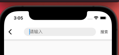
)TextField文本内容不居中问题
我们通常在使用textField的时候默认将其border设置为 InputBorder.none,如果我们给textField设置外边框,你会发现,内容竟然居中了
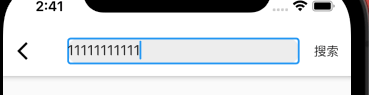
由此可见,当我们给textField设置了外边框,textField的内容就会居中显示,那么剩下的问题就简单了,将外边框设置为透明色即可
有一点很重要 contentPadding一定要设置上下边距为0
contentPadding:EdgeInsets.only(top:0,bottom:0)

结果如下:
监听滑动通知
NotificationListener(
	onNotification: (scrollNotification){
        if(scrollNotification is ScrollUpdateNotification){
            ...
        }
    },
    child:
)
查看图片
可以通过拖动以平移、缩放和拖放子组件
InteractiveViewer(
  child: Image.asset('assets/images/go_board_09x09.png'),
)
左滑返回
return new MaterialApp(
      home: new HomePage(),
      theme: new ThemeData(platform: TargetPlatform.iOS),
);
退出应用
SystemChannels.platform.invokeMethod("SystemNavigator.pop");子元素被父元素限制宽高
UnconstrainedBox{
  constrainedAxis: Axis.vertical,
  child: SizedBox(
  	width: width;
    child: Dialog(),
  ),
}
Container背景渐变
Container(
  width: 1.sw,
  height: 1.sh,
  padding: EdgeInsets.all(20.w),
  decoration: BoxDecoration(
    //页面背景渐变色
    gradient: LinearGradient(
      begin: Alignment.topCenter,
      end: Alignment.bottomCenter,
      colors: colorsList,
    ),
  ),
  child: ListView(
    children: [
    ],
  ),
),
内阴影效果
decoration: BoxDecoration(
  //内阴影效果
  boxShadow: [
    BoxShadow(
      color: Color(0xFF252939),
    ),
    BoxShadow(
      color: Color(0x40FFFFFF),
      offset: Offset(0, -24.w),
      spreadRadius: -2.0,
      blurRadius: 20.0,
    ),
  ]
),
外阴影效果
decoration: BoxDecoration(
  //内阴影效果
  boxShadow: [
    BoxShadow(
      color: Color(0xFF252939),
    ),
    BoxShadow(
      color: Color(0x40FFFFFF),
      offset: Offset(0, 6),
      blurRadius: 8,
      blurRadius: 0,
    ),
  ]
),
TextField使用
基本属性
const TextField({
    Key key,
    this.controller,//控制器
    this.focusNode,//焦点
    this.obscureText = false,//是否隐藏文本,即显示密码类型
    this.maxLines = 1,//最多行数,高度与行数同步
    this.autofocus = false,//自动聚焦
    this.decoration = const InputDecoration(),//装饰
    TextInputType keyboardType,//键盘类型,即输入类型
    this.onChanged,//输入改变回调

    //以下属性不常用,用到再来查看
    this.textInputAction,//键盘按钮
    this.textCapitalization = TextCapitalization.none,//大小写
    this.style,//样式
    this.strutStyle,
    this.textAlign = TextAlign.start,//对齐方式
    this.textDirection,
    this.autocorrect = true,//自动更正
    this.minLines,//最小行数
    this.expands = false,
    this.maxLength,//最多输入数,有值后右下角就会有一个计数器
    this.maxLengthEnforced = true,
    this.onEditingComplete,//输入完成时,配合TextInputAction.done使用
    this.onSubmitted,//提交时,配合TextInputAction
    this.inputFormatters,//输入校验
    this.enabled,//是否可用
    this.cursorWidth = 2.0,//光标宽度
    this.cursorRadius,//光标圆角
    this.cursorColor,//光标颜色
    this.keyboardAppearance,
    this.scrollPadding = const EdgeInsets.all(20.0),
    this.dragStartBehavior = DragStartBehavior.start,
    this.enableInteractiveSelection,
    this.onTap,//点击事件
    this.buildCounter,
    this.scrollPhysics,
  })
InputDecoration 装饰器
InputDecoration({
    this.icon,    //位于装饰器外部和输入框前面的图片
    this.labelText,  //用于描述输入框,例如这个输入框是用来输入用户名还是密码的,当输入框获取焦点时默认会浮动到上方,
    this.labelStyle,  // 控制labelText的样式,接收一个TextStyle类型的值
    this.helperText, //辅助文本,位于输入框下方,如果errorText不为空的话,则helperText不会显示
    this.helperStyle, //helperText的样式
    this.hintText,  //提示文本,位于输入框内部
    this.hintStyle, //hintText的样式
    this.hintMaxLines, //提示信息最大行数
    this.errorText,  //错误信息提示
    this.errorStyle, //errorText的样式
    this.errorMaxLines,   //errorText最大行数
    this.hasFloatingPlaceholder = true,  //labelText是否浮动,默认为true,修改为false则labelText在输入框获取焦点时不会浮动且不显示
    this.isDense,   //改变输入框是否为密集型,默认为false,修改为true时,图标及间距会变小
    this.contentPadding, //内间距
    this.prefixIcon,  //位于输入框内部起始位置的图标。
    this.prefix,   //预先填充的Widget,跟prefixText同时只能出现一个
    this.prefixText,  //预填充的文本,例如手机号前面预先加上区号等
    this.prefixStyle,  //prefixText的样式
    this.suffixIcon, //位于输入框后面的图片,例如一般输入框后面会有个眼睛,控制输入内容是否明文
    this.suffix,  //位于输入框尾部的控件,同样的不能和suffixText同时使用
    this.suffixText,//位于尾部的填充文字
    this.suffixStyle,  //suffixText的样式
    this.counter,//位于输入框右下方的小控件,不能和counterText同时使用
    this.counterText,//位于右下方显示的文本,常用于显示输入的字符数量
    this.counterStyle, //counterText的样式
    this.filled,  //如果为true,则输入使用fillColor指定的颜色填充
    this.fillColor,  //相当于输入框的背景颜色
    this.errorBorder,   //errorText不为空,输入框没有焦点时要显示的边框
    this.focusedBorder,  //输入框有焦点时的边框,如果errorText不为空的话,该属性无效
    this.focusedErrorBorder,  //errorText不为空时,输入框有焦点时的边框
    this.disabledBorder,  //输入框禁用时显示的边框,如果errorText不为空的话,该属性无效
    this.enabledBorder,  //输入框可用时显示的边框,如果errorText不为空的话,该属性无效
    this.border, //正常情况下的border
    this.enabled = true,  //输入框是否可用
    this.semanticCounterText,
    this.alignLabelWithHint,
  })
文本框初始化时显示默认值
class _FooState extends State<Foo> {
  TextEditingController _controller;

  @override
  void initState() {
    super.initState();
    _controller = new TextEditingController(text: '初始化内容');
  }

  @override
  Widget build(BuildContext context) {
    return new Column(
      children: <Widget>[
        new TextField(
          // 当TextField 第一次创建时,controller会包含初始值,
          // 当用户修改文本框内容时,会修改controller的值。
          controller: _controller,
        ),
        new RaisedButton(
          onPressed: () {
            // 通过clear()可以清空controller的值。
            _controller.clear();
          },
          child: new Text('清空'),
        ),
      ],
    );
  }
}
问题1:动态创建文本框初始值 一般情况下,直接使用这种方式,没有任何问题。但是现在有一种情况:
**问题1: **当页面文本框中的初始值是动态的,从后台获取到的时候,应该怎么办呢?
这种情况下,说明创建TextEditingController时,并不知道文本内容。这个时候如果动态修改controller的话,会报错,根本没法使用。
这种情况我根本没遇到过,但是我觉得Flutter肯定有解决方法。所以我去找了一下Flutter的文档,总算是没有白找,找到了一个(https://api.flutter.dev/flutter/material/TextFormField-class.html)[组件] TextFormField。
意思就是说,当不指定controller时,initialValue 就可以自动生成controller的初始值。
既然有解决方案,那么就是修改一下代码即可。
class _FooState extends State<Foo> {

  @override
  void initState() {
    super.initState();
  }

  @override
  Widget build(BuildContext context) {
    return new Column(
      children: <Widget>[
        new TextFormField(
          initialValue: "初始值"
        ),
      ],
    );
  }
}
问题2: TextField和TextFormField的区别?
总结: 如果需要使用保存、重置、验证用户输入的情况下,使用TextFormField。 如果只需要简单的捕获用户的输入行为,只需要使用TextField组件即可。
TextField 设置高度后文本无法居中
推荐的方式是使用isCollapsed: true来修正:
TextField(
  decoration: InputDecoration(
    isCollapsed: true,//去除自带内边距
    ...
  )
)
TextField 去除边框
border: InputBorder.none,定位组件居中
水平居中
Positioned(
  left:0,
  right:0,
  child: Center(
    child: Image.asset(
      "assets/images/ic_arrow.png",
      fit: BoxFit.contain,
      width: 20.w,
      height: 12.w,
    ),
  ),
),
垂直居中
Positioned(
  top: 0,
  bottom: 0,
  child: Center(
    child: Image.asset(
      "assets/images/ic_arrow.png",
      fit: BoxFit.contain,
      width: 20.w,
      height: 12.w,
    ),
  ),
),
水平垂直居中
Positioned(
  left:0,
  right:0,
  top: 0,
  bottom: 0,
  child: Center(
    child: Image.asset(
      "assets/images/ic_arrow.png",
      fit: BoxFit.contain,
      width: 20.w,
      height: 12.w,
    ),
  ),
),
分割线
Divider 水平分割线 VerticalDivider 垂直分割线
给某个边角设置
 Container(
   decoration: BoxDecoration(
     borderRadius: BorderRadius.only(
       topLeft: Radius.circular(30),
       bottomRight: Radius.circular(30),
     ),
  ),
),
封装的评星
class StarRating extends StatelessWidget {
  final double rating;
  final double maxRating;
  final Widget unselectedImage;
  final Widget selectedImage;
  final int count;
  final double size;
  final Color unselectedColor;
  final Color selectedColor;

  StarRating({
    @required this.rating,  // 当前评分
    this.maxRating = 10,  // 最高评分
    Widget unselectedImage,
    Widget selectedImage,
    this.count = 5,  // 星星的个数
    this.size = 40,
    this.unselectedColor = Colors.grey,
    this.selectedColor = Colors.orange
  }) : unselectedImage = unselectedImage ?? Icon(Icons.star, color: unselectedColor, size: size),
        selectedImage = selectedImage ?? Icon(Icons.star, color: selectedColor, size: size);


  @override
  Widget build(BuildContext context) {
    return Stack(
      children: [
        UnSelectStar(),
        SelectedStar()
      ],
    );
  }


  // 宽度 = 评分 / 每个星星代表的分数 * 星星的大小
  // var width = ping / (total / count) * size;


  Widget UnSelectStar() {
    return Row(
      mainAxisSize: MainAxisSize.min,
      children: List.generate(count, (index) =>
        unselectedImage
      ),
    );
  }

  Widget SelectedStar() {
    double width = rating / (maxRating / count) * size;
    return ClipRect(
      clipper: MyClipRect(width: width),
      child: Row(
        mainAxisSize: MainAxisSize.min,
        children: List.generate(5, (index) =>
            selectedImage
        ),
      ),
    );
  }
}

class MyClipRect extends CustomClipper<Rect>{
  double width;
  MyClipRect({this.width});
  @override
  getClip(Size size) {
   return Rect.fromLTRB(0, 0, width, size.height);
  }

  @override
  bool shouldReclip(MyClipRect oldClipper) {
    return width != oldClipper;
  }

}