顶部导航栏选项卡TabBar
顶部导航栏选项卡TabBar
const TabBar({
  Key? key,
  required this.tabs,// tab组件列表
  this.controller,// tabBar控制器
  this.isScrollable = false,// 是否支持滚动
  this.padding,// 内部tab内边距
  this.indicatorColor,// 指示器颜色
  this.automaticIndicatorColorAdjustment = true,// 指示器颜色是否自动跟随主题颜色
  this.indicatorWeight = 2.0,// 指示器高度
  this.indicatorPadding = EdgeInsets.zero,// 指示器padding
  this.indicator,//选择指示器样式
  this.indicatorSize,//选择指示器大小
  this.labelColor,// 选择标签文本颜色
  this.labelStyle,// 选择标签文本样式
  this.labelPadding,// 整体标签边距
  this.unselectedLabelColor,//未选中标签颜色
  this.unselectedLabelStyle,// 未选中标签样式
  this.dragStartBehavior = DragStartBehavior.start,//设置点击水波纹效果 跟随全局点击效果
  this.overlayColor,// 设置水波纹颜色
  this.mouseCursor, // 鼠标指针悬停的效果 App用不到
  this.enableFeedback,// 点击是否反馈声音触觉。
  this.onTap,// 点击Tab的回调
  this.physics,// 滚动边界交互
})
如果要禁止滑动切换,则需如下设置
		Container(
          color: Color.fromRGBO(26, 172, 255, 1),
          child: TabBarView(
            //TabBarView 默认支持手势滑动,若要禁止设置 NeverScrollableScrollPhysics
            physics: NeverScrollableScrollPhysics(),
            children: <Widget>[
                Center(child:Text('view1')),
                Center(child:Text('view2')),
                Center(child:Text('view3')),
            ],
          ),
        ),
基本使用
这里介绍一些方法上的使用
indicatorColor, indicatorWeight
设置 indicator 颜色和宽度
  TabBar _tabBar(){
    return TabBar(
      tabs: _tabs(),
      isScrollable: true,
      indicatorColor: Colors.red,
      indicatorWeight: 15,
    );
  }
indicatorSize
使用 indicatorSize 修改 indicator 大小。
  TabBar _tabBar(){
    return TabBar(
      tabs: _tabs(),
      isScrollable: true,
      indicatorColor: Colors.red,
      indicatorWeight: 15,
      indicatorSize: TabBarIndicatorSize.label,
    );
  }
indicatorPadding
使用 indicatorPadding 修改 indicator 的位置。
  TabBar _tabBar(){
    return TabBar(
      tabs: _tabs(),
      isScrollable: true,
      indicatorColor: Colors.red,
      indicatorWeight: 15,
      indicatorSize: TabBarIndicatorSize.label,
      indicatorPadding: EdgeInsets.only(bottom: 15),
    );
  }
indicator
使用 indicator 属性自定义 indicator。 注意:此时会优先执行自定义的 indicator,其他的设置会被覆盖掉。
  TabBar _tabBar(){
    return TabBar(
      tabs: _tabs(),
      isScrollable: true,
      indicatorColor: Colors.red,
      indicatorWeight: 15,
      indicatorSize: TabBarIndicatorSize.label,
      indicatorPadding: EdgeInsets.only(bottom: 15),
      indicator: UnderlineTabIndicator(
        borderSide: BorderSide(
          color: Colors.red,
          width: 3
        ),
      ),
    );
  }
字体颜色大小设置
具体描述见上方表格。
  TabBar _tabBar(){
    return TabBar(
      tabs: _tabs(),
      isScrollable: true,
      indicatorColor: Colors.red,
      indicatorWeight: 5,
      indicatorSize: TabBarIndicatorSize.label,
      labelColor: Colors.yellow,
      labelStyle: TextStyle(
        fontSize: 15,
      ),
      unselectedLabelColor: Colors.black,
      unselectedLabelStyle: TextStyle(
        fontSize: 12
      ),
      // indicatorPadding: EdgeInsets.only(bottom: 15),
      // indicator: UnderlineTabIndicator(
      //   borderSide: BorderSide(
      //     color: Colors.red,
      //     width: 3
      //   ),
      // ),
    );
  }
labelPadding
使用 labelPadding 来改变 label 位置。
  TabBar _tabBar(){
    return TabBar(
      tabs: _tabs(),
      isScrollable: true,
      indicatorColor: Colors.red,
      indicatorWeight: 5,
      indicatorSize: TabBarIndicatorSize.label,
      labelColor: Colors.yellow,
      labelStyle: TextStyle(
        fontSize: 15,
      ),
      unselectedLabelColor: Colors.black,
      unselectedLabelStyle: TextStyle(
        fontSize: 12
      ),
      labelPadding: EdgeInsets.only(top: 30,left: 15),
      // indicatorPadding: EdgeInsets.only(bottom: 15),
      // indicator: UnderlineTabIndicator(
      //   borderSide: BorderSide(
      //     color: Colors.red,
      //     width: 3
      //   ),
      // ),
    );
  }
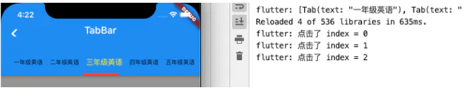
onTap 点击事件
  TabBar _tabBar(){
    return TabBar(
      tabs: _tabs(),
      isScrollable: true,
      indicatorColor: Colors.red,
      indicatorWeight: 5,
      indicatorSize: TabBarIndicatorSize.label,
      labelColor: Colors.yellow,
      labelStyle: TextStyle(
        fontSize: 15,
      ),
      unselectedLabelColor: Colors.black,
      unselectedLabelStyle: TextStyle(
        fontSize: 12
      ),
      labelPadding: EdgeInsets.only(top: 30,left: 15),
      // indicatorPadding: EdgeInsets.only(bottom: 15),
      // indicator: UnderlineTabIndicator(
      //   borderSide: BorderSide(
      //     color: Colors.red,
      //     width: 3
      //   ),
      // ),

      onTap: (index){
        print("点击了 index = ${index}");
      },
    );
  }
标题栏顶部选项卡切换
import 'package:flutter/material.dart';
class Home extends StatelessWidget {
const Home({Key? key}) : super(key: key);
@override
Widget build(BuildContext context) {
return DefaultTabController(//DefaultTabController 这个配置tabs的控件
length: 2, //顶部tab切换的长度
child: Scaffold(
appBar: AppBar(
title: Text('标题'),
centerTitle: true, //标题是否居中
backgroundColor: Colors.red, //配置导航栏颜色
//配置导航后置控件
leading: IconButton(
//IconButton 按钮图标意思,,就不实用Icon了
icon: Icon(Icons.menu),
onPressed: () {},
),
//配置导航前置控件
actions: <Widget>[
IconButton(
//IconButton 按钮图标意思,,就不实用Icon了
icon: Icon(Icons.history_toggle_off_rounded),
onPressed: () {},
),
IconButton(
//IconButton 按钮图标意思,,就不实用Icon了
icon: Icon(Icons.youtube_searched_for),
onPressed: () {},
)
],
bottom: TabBar(//配置顶部导航选项卡
tabs: <Widget>[//需要几个选项卡写几个选项卡
Tab(text:'热门'),
Tab(text:'推荐'),
],
),
),
body: TabBarView(//配置点击顶部选项卡切换下面内容
children:[//这个里面放顶部切换的内容,有几个切换选项卡,里面就放几个ListView
ListView(
children:[
ListTile(
title:Text('第一个tab页面')
),
ListTile(
title:Text('第一个tab页面')
)
]
),
ListView(
children:[
ListTile(
title:Text('第二个tab页面')
),
ListTile(
title:Text('第二个tab页面')
)
]
)
],
),
),
);
}
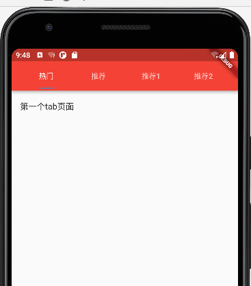
}结果如下,支持滑动

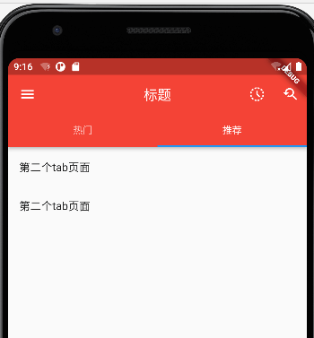
标题区域作为选项卡切换
带标题图标选项卡切换
import 'package:flutter/material.dart';
class Home extends StatelessWidget {
  const Home({Key? key}) : super(key: key);

  @override
  Widget build(BuildContext context) {
    return DefaultTabController(
      length: 2,//顶部tab切换的长度
      child: Scaffold(
        appBar: AppBar(
          title: Container(
            child: TabBar(
              tabs: [//需要几个选项写几个选项卡
                Tab(text:'热门'),
                Tab(text:'推荐'),
              ],
            ),
          ),
          centerTitle: true, //标题是否居中
          backgroundColor: Colors.red, //配置导航栏颜色
          //配置导航后置控件
          leading: IconButton(
            //IconButton 按钮图标意思,,就不实用Icon了
            icon: Icon(Icons.menu),
            onPressed: () {},
          ),
          //配置导航前置控件
          actions: <Widget>[
            IconButton(
              //IconButton 按钮图标意思,,就不实用Icon了
              icon: Icon(Icons.history_toggle_off_rounded),
              onPressed: () {},
            ),
            IconButton(
              //IconButton 按钮图标意思,,就不实用Icon了
              icon: Icon(Icons.youtube_searched_for),
              onPressed: () {},
            )
          ],
        ),
        body: TabBarView(//配置点击顶部选项卡切换下面内容
          children:[//这个里面放顶部切换的内容,有几个切换选项卡,里面就放几个ListView
            ListView(
                children:[
                  ListTile(
                      title:Text('第一个tab页面')
                  ),
                ]
            ),
            ListView(
                children:[
                  ListTile(
                      title:Text('第二个tab页面')
                  ),
                ]
            ),
          ]
        ),
      ),
    );
  }
}
结果
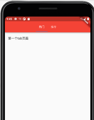
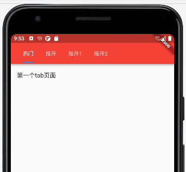
不带标题图标选项卡切换
import 'package:flutter/material.dart';
class Home extends StatelessWidget {
  const Home({Key? key}) : super(key: key);

  @override
  Widget build(BuildContext context) {
    return DefaultTabController(
      length: 2,//顶部tab切换的长度
      child: Scaffold(
        appBar: AppBar(
          title: Container(
            child: TabBar(
              tabs: [//需要几个选项写几个选项卡
                Tab(text:'热门'),
                Tab(text:'推荐'),
              ],
            ),
          ),
          centerTitle: true, //标题是否居中
          backgroundColor: Colors.red, //配置导航栏颜色
        ),
        body: TabBarView(//配置点击顶部选项卡切换下面内容
          children:[//这个里面放顶部切换的内容,有几个切换选项卡,里面就放几个ListView
            ListView(
                children:[
                  ListTile(
                      title:Text('第一个tab页面')
                  ),
                ]
            ),
            ListView(
                children:[
                  ListTile(
                      title:Text('第二个tab页面')
                  ),
                ]
            ),
          ]
        ),
      ),
    );
  }
}
结果
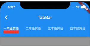
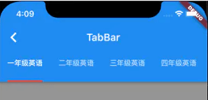
等宽标题栏选项卡切换
import 'package:flutter/material.dart';
class Home extends StatelessWidget {
  const Home({Key? key}) : super(key: key);

  @override
  Widget build(BuildContext context) {
    return DefaultTabController(
      length: 4,//顶部tab切换的长度
      child: Scaffold(
        appBar: AppBar(
          title: Row(
            children: [
              Expanded(
                child: TabBar(
                  indicatorSize: TabBarIndicatorSize.label,//与文字等宽
                  tabs: [//需要几个选项写几个选项卡
                    Tab(text:'热门'),
                    Tab(text:'推荐'),
                    Tab(text:'推荐1'),
                    Tab(text:'推荐2'),
                  ],
                ),
              )
            ],
          ),
          centerTitle: true, //标题是否居中
          backgroundColor: Colors.red, //配置导航栏颜色
        ),
        body: TabBarView(//配置点击顶部选项卡切换下面内容
          children:[//这个里面放顶部切换的内容,有几个切换选项卡,里面就放几个ListView
            ListView(
                children:[
                  ListTile(
                      title:Text('第一个tab页面')
                  ),
                ]
            ),
            ListView(
                children:[
                  ListTile(
                      title:Text('第二个tab页面')
                  ),
                ]
            ),
            ListView(
                children:[
                  ListTile(
                      title:Text('第三个tab页面')
                  ),
                ]
            ),
            ListView(
                children:[
                  ListTile(
                      title:Text('第四个tab页面')
                  ),
                ]
            ),
          ]
        ),
      ),
    );
  }
}
结果
在上面代码加上isScrollable:true,代码 在选项卡少的时候就居左
TabBar(
  isScrollable:true,//是否支持滚动
  indicatorSize: TabBarIndicatorSize.label,//与文字等宽
  tabs: [//需要几个选项写几个选项卡
    Tab(text:'热门'),
    Tab(text:'推荐'),
    Tab(text:'推荐1'),
    Tab(text:'推荐2'),
  ],
),
结果
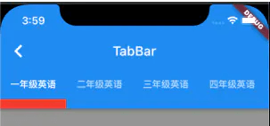
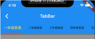
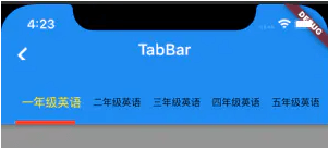
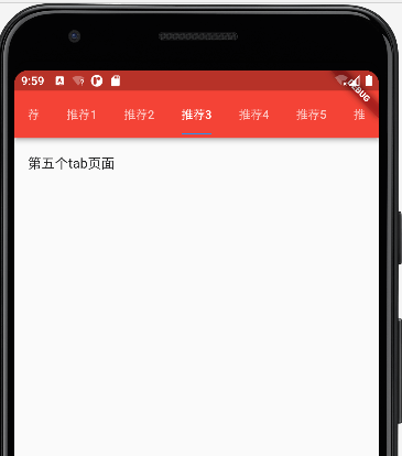
配置很多选项卡滚动
注意:isScrollable 默认为 false,设置为 true 才可以滑动,否则数据过多时,可能会自适应效果,导致 title 被挤压。
重要属性:isScrollable:true 是否支持滚动
在DefaultTabController中length:10,定义10个个数
这里也相对应设置10个
TabBar(
  isScrollable:true,//是否支持滚动
  indicatorSize: TabBarIndicatorSize.label,//与文字等宽
  tabs: [//需要几个选项写几个选项卡
    Tab(text:'热门'),
    Tab(text:'推荐'),
    Tab(text:'推荐1'),
    Tab(text:'推荐2'),
    Tab(text:'推荐3'),
    Tab(text:'推荐4'),
    Tab(text:'推荐5'),
    Tab(text:'推荐6'),
    Tab(text:'推荐7'),
    Tab(text:'推荐8'),
  ],
),
相对应的写10个
TabBarView(//配置点击顶部选项卡切换下面内容
  children:[//这个里面放顶部切换的内容,有几个切换选项卡,里面就放几个ListView
    ListView(
        children:[
          ListTile(
              title:Text('第一个tab页面')
          ),
        ]
    ),
    ListView(
        children:[
          ListTile(
              title:Text('第二个tab页面')
          ),
        ]
    ),
    ListView(
        children:[
          ListTile(
              title:Text('第三个tab页面')
          ),
        ]
    ),
    ListView(
        children:[
          ListTile(
              title:Text('第四个tab页面')
          ),
        ]
    ),
    ListView(
        children:[
          ListTile(
              title:Text('第五个tab页面')
          ),
        ]
    ),
    ListView(
        children:[
          ListTile(
              title:Text('第六个tab页面')
          ),
        ]
    ),
    ListView(
        children:[
          ListTile(
              title:Text('第七个tab页面')
          ),
        ]
    ),
    ListView(
        children:[
          ListTile(
              title:Text('第八个tab页面')
          ),
        ]
    ),
    ListView(
        children:[
          ListTile(
              title:Text('第九个tab页面')
          ),
        ]
    ),
    ListView(
        children:[
          ListTile(
              title:Text('第十个tab页面')
          ),
        ]
    ),
  ]
),
完整代码
import 'package:flutter/material.dart';
class Home extends StatelessWidget {
  const Home({Key? key}) : super(key: key);

  @override
  Widget build(BuildContext context) {
    return DefaultTabController(
      length: 10,//顶部tab切换的长度
      child: Scaffold(
        appBar: AppBar(
          title: Row(
            children: [
              Expanded(
                child: TabBar(
                  isScrollable:true,//是否支持滚动
                  indicatorSize: TabBarIndicatorSize.label,//与文字等宽
                  tabs: [//需要几个选项写几个选项卡
                    Tab(text:'热门'),
                    Tab(text:'推荐'),
                    Tab(text:'推荐1'),
                    Tab(text:'推荐2'),
                    Tab(text:'推荐3'),
                    Tab(text:'推荐4'),
                    Tab(text:'推荐5'),
                    Tab(text:'推荐6'),
                    Tab(text:'推荐7'),
                    Tab(text:'推荐8'),
                  ],
                ),
              )
            ],
          ),
          centerTitle: true, //标题是否居中
          backgroundColor: Colors.red, //配置导航栏颜色
        ),
        body: TabBarView(//配置点击顶部选项卡切换下面内容
          children:[//这个里面放顶部切换的内容,有几个切换选项卡,里面就放几个ListView
            ListView(
                children:[
                  ListTile(
                      title:Text('第一个tab页面')
                  ),
                ]
            ),
            ListView(
                children:[
                  ListTile(
                      title:Text('第二个tab页面')
                  ),
                ]
            ),
            ListView(
                children:[
                  ListTile(
                      title:Text('第三个tab页面')
                  ),
                ]
            ),
            ListView(
                children:[
                  ListTile(
                      title:Text('第四个tab页面')
                  ),
                ]
            ),
            ListView(
                children:[
                  ListTile(
                      title:Text('第五个tab页面')
                  ),
                ]
            ),
            ListView(
                children:[
                  ListTile(
                      title:Text('第六个tab页面')
                  ),
                ]
            ),
            ListView(
                children:[
                  ListTile(
                      title:Text('第七个tab页面')
                  ),
                ]
            ),
            ListView(
                children:[
                  ListTile(
                      title:Text('第八个tab页面')
                  ),
                ]
            ),
            ListView(
                children:[
                  ListTile(
                      title:Text('第九个tab页面')
                  ),
                ]
            ),
            ListView(
                children:[
                  ListTile(
                      title:Text('第十个tab页面')
                  ),
                ]
            ),
          ]
        ),
      ),
    );
  }
}
顶部tab切换监听状态(常用)
通过DefaultTabController组件实现了AppBar里面的顶部导航切换,但是实际项目中,有网络请求,上拉加载下拉刷新等操作DefaultTabController就不方便操作,所以就需要TabController实现TabBar。
TabController常用属性介绍
index:当前索引值
previousIndex:之前索引值
length:tab的数量
indexIsChanging:是否在切换tab,点击条目切换tab为true,滑动切换tab为false
animation:value表示TabBar的tab当前位置以及TabBar 和TabBarView的scrollOffsets
TabController常用方法介绍
addListener:添加监听
dispose:销毁
notifyListeners:激活所有监听
removeListener:清除监听
1、TabController组件必须是在一个继承StatefulWidget的动态组件中
class Home extends StatefulWidget {
  const Home({Key? key}) : super(key: key);

  @override
  State<Home> createState() => _HomeState();
}
2、必须实现SingleTickerProviderStateMixin
// with SingleTickerProviderStateMixin 多继承; 继承SingleTickerProviderStateMixin这个类
class _HomeState extends State<Home> with SingleTickerProviderStateMixin {
  //需要定义一个Controller
  late TabController _tabController;
3、组件初始化的时候,实例化TabController,实例化的时候,传两个参数,length:tab的个数,vsync:this(固定写法)
//实例化TabController
_tabController = new TabController(
    length: titleTabs.length,
    vsync:this
);
4、在TabBar组件和TabBarView组件中的controller指定,实例化的TabController
TabBar(
  indicatorSize: TabBarIndicatorSize.label,//与文字等宽
  controller: this._tabController,//注意 这里使用
  tabs: titleTabs,
),TabBarView(//配置点击顶部选项卡切换下面内容
controller: this._tabController,//注意 这里使用
children:[//这个里面放顶部切换的内容,有几个切换选项卡,里面就放几个ListView
ListView(
children:[
ListTile(
title:Text('第一个tab页面')
),
]
),
ListView(
children:[
ListTile(
title:Text('第二个tab页面')
),
]
),
]
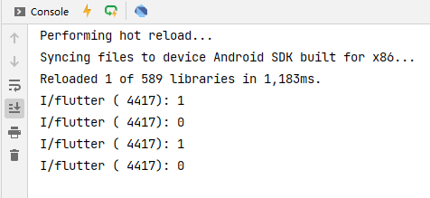
),5、TabController添加addListener,点击tab回调两次的解决方法(见demo)
1、点击tab回调一次,滑动切换tab不会回调
//监听切换选择中状态的改变
  _tabController.addListener(() {
    if(_tabController.indexIsChanging){
      print(_tabController.index);
    }
});
2、 //点击tab时或滑动tab回调一次
//监听切换选择中状态的改变
  _tabController.addListener(() {
    //因为点击选项卡会执行两次,而滑动执行一次,所以这里做处理,,点击和滑动都执行一次
    if(_tabController.index.toDouble() ==_tabController.animation?.value){
      print(_tabController.index);
    }
});
完整代码
import 'package:flutter/material.dart';
class Home extends StatefulWidget {
const Home({Key? key}) : super(key: key);
@override
State<Home> createState() => _HomeState();
}
// with SingleTickerProviderStateMixin 多继承; 继承SingleTickerProviderStateMixin这个类
class _HomeState extends State<Home> with SingleTickerProviderStateMixin {
//需要定义一个Controller
late TabController _tabController;
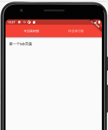
final List<Tab> titleTabs = <Tab>[
Tab(
text: '今日实时榜',
),
Tab(
text: '昨日排行榜',
),
];
void initState(){
super.initState();
//实例化TabController
_tabController = new TabController(
length: titleTabs.length,
vsync:this
);
//监听切换选择中状态的改变
_tabController.addListener(() {
//因为点击选项卡会执行两次,而滑动执行一次,所以这里做处理,,点击和滑动都执行一次
if(_tabController.index.toDouble() ==_tabController.animation?.value){
print(_tabController.index);
}
});
}
@override
Widget build(BuildContext context) {
return DefaultTabController(
length: 2,//顶部tab切换的长度
child: Scaffold(
appBar: AppBar(
title: Row(
children: [
Expanded(
child: TabBar(
indicatorSize: TabBarIndicatorSize.label,//与文字等宽
controller: this._tabController,//注意 这里使用
tabs: titleTabs,
),
)
],
),
centerTitle: true, //标题是否居中
backgroundColor: Colors.red, //配置导航栏颜色
),
body: TabBarView(//配置点击顶部选项卡切换下面内容
controller: this._tabController,//注意 这里使用
children:[//这个里面放顶部切换的内容,有几个切换选项卡,里面就放几个ListView
ListView(
children:[
ListTile(
title:Text('第一个tab页面')
),
]
),
ListView(
children:[
ListTile(
title:Text('第二个tab页面')
),
]
),
]
),
),
);
}
}