常用组件
常用组件
气泡提示(Popup)
Popup属性可绑定在组件上显示气泡弹窗提示,设置弹窗内容、交互逻辑和显示状态。主要用于屏幕录制、信息弹出提醒等显示状态。
气泡分为两种类型,一种是系统提供的气泡PopupOptions,一种是开发者可以自定义的气泡CustomPopupOptions。其中PopupOptions为系统提供的气泡,通过配置primaryButton、secondaryButton来设置带按钮的气泡。CustomPopupOptions通过配置builder参数来设置自定义的气泡。
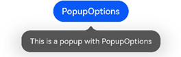
文本提示气泡
文本提示气泡常用于只展示带有文本的信息提示,不带有任何交互的场景。Popup属性需绑定组件,当bindPopup属性中参数show为true的时候会弹出气泡提示。
在Button组件上绑定Popup属性,每次点击Button按钮,handlePopup会切换布尔值,当其为true时,触发bindPopup弹出气泡。
@Entry
@Component
struct PopupExample {
  @State handlePopup: boolean = false

  build() {
    Column() {
      Button('PopupOptions')
        .onClick(() => {
          this.handlePopup = !this.handlePopup
        })
        .bindPopup(this.handlePopup, {
          message: 'This is a popup with PopupOptions',
        })
    }.width('100%').padding({ top: 5 })
  }
}
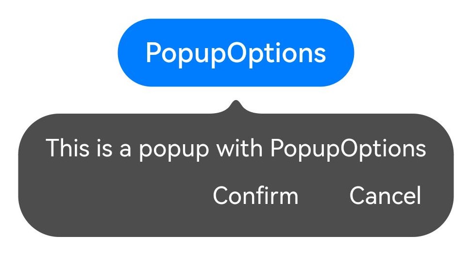
带按钮的提示气泡
通过primaryButton、secondaryButton属性为气泡最多设置两个Button按钮,通过此按钮进行简单的交互;开发者可以通过配置action参数来设置想要触发的操作。
@Entry
@Component
struct PopupExample22 {
  @State handlePopup: boolean = false
  build() {
    Column() {
      Button('PopupOptions').margin({top:200})
        .onClick(() => {
          this.handlePopup = !this.handlePopup
        })
        .bindPopup(this.handlePopup, {
          message: 'This is a popup with PopupOptions',
          primaryButton:{
            value:'Confirm',
            action: () => {
              this.handlePopup = !this.handlePopup
              console.info('confirm Button click')
            }
          },
          secondaryButton: {
            value: 'Cancel',
            action: () => {
              this.handlePopup = !this.handlePopup
            }
          },
        })
    }.width('100%').padding({ top: 5 })
  }
}
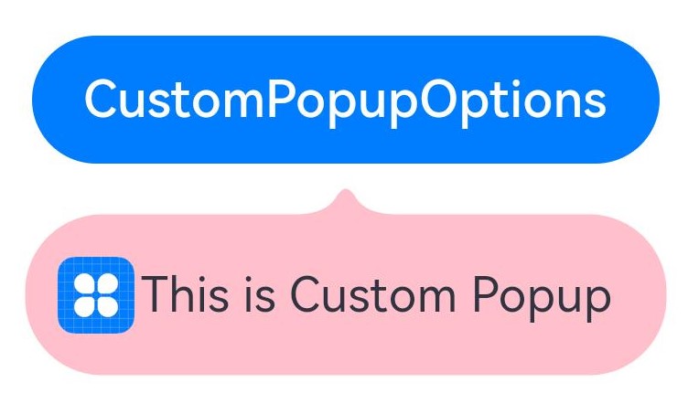
自定义气泡
开发者可以使用构建器CustomPopupOptions创建自定义气泡,@Builder中可以放自定义的内容。除此之外,还可以通过popupColor等参数控制气泡样式。
@Entry
@Component
struct Index {
  @State customPopup: boolean = false
  // popup构造器定义弹框内容
  @Builder popupBuilder() {
    Row({ space: 2 }) {
      Image($r("app.media.icon")).width(24).height(24).margin({ left: 5 })
      Text('This is Custom Popup').fontSize(15)
    }.width(200).height(50).padding(5)
  }
  build() {
    Column() {
      Button('CustomPopupOptions')
        .position({x:100,y:200})
        .onClick(() => {
          this.customPopup = !this.customPopup
        })
        .bindPopup(this.customPopup, {
          builder: this.popupBuilder, // 气泡的内容
          placement:Placement.Bottom, // 气泡的弹出位置
          popupColor:Color.Pink // 气泡的背景色
        })
    }
    .height('100%')
  }
}
菜单(Menu)
Menu是菜单接口,一般用于鼠标右键弹窗、点击弹窗等。具体用法请参考Menu控制。
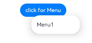
创建默认样式的菜单
菜单需要调用bindMenu接口来实现。bindMenu响应绑定组件的点击事件,绑定组件后手势点击对应组件后即可弹出。
Button('click for Menu')
  .bindMenu([
  {
    value: 'Menu1',
    action: () => {
      console.info('handle Menu1 select')
    }
  }
])
创建自定义样式的菜单
当默认样式不满足开发需求时,可使用@Builder自定义菜单内容。可通过bindMenu接口进行菜单的自定义。
@Builder开发菜单内的内容
@State select: boolean = true
private iconStr: ResourceStr = $r("app.media.view_list_filled")
private iconStr2: ResourceStr = $r("app.media.view_list_filled")
@Builder
SubMenu() {
  Menu() {
    MenuItem({ content: "复制", labelInfo: "Ctrl+C" })
    MenuItem({ content: "粘贴", labelInfo: "Ctrl+V" })
  }
}

@Builder
MyMenu(){
  Menu() {
    MenuItem({ startIcon: $r("app.media.icon"), content: "菜单选项" })
    MenuItem({ startIcon: $r("app.media.icon"), content: "菜单选项" }).enabled(false)
    MenuItem({
      startIcon: this.iconStr,
      content: "菜单选项",
      endIcon: $r("app.media.arrow_right_filled"),
      // 当builder参数进行配置时,表示与menuItem项绑定了子菜单。鼠标hover在该菜单项时,会显示子菜单。
      builder: this.SubMenu.bind(this),
    })
    MenuItemGroup({ header: '小标题' }) {
      MenuItem({ content: "菜单选项" })
        .selectIcon(true)
        .selected(this.select)
        .onChange((selected) => {
       console.info("menuItem select" + selected);
       this.iconStr2 = $r("app.media.icon");
        })
      MenuItem({
        startIcon: $r("app.media.view_list_filled"),
        content: "菜单选项",
        endIcon: $r("app.media.arrow_right_filled"),
        builder: this.SubMenu.bind(this)
      })
    }
    MenuItem({
      startIcon: this.iconStr2,
      content: "菜单选项",
      endIcon: $r("app.media.arrow_right_filled")
    })
  }
}
bindMenu属性绑定组件
Button('click for Menu')
  .bindMenu(this.MyMenu)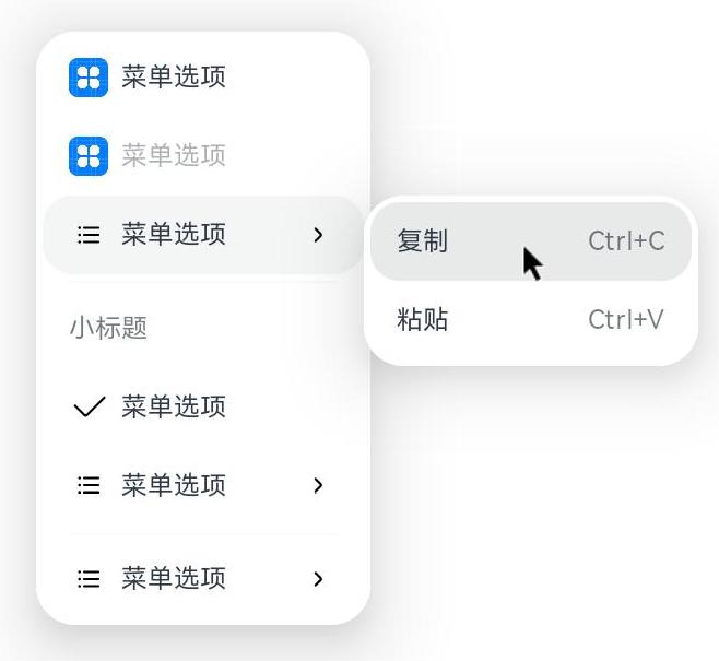
创建支持右键或长按的菜单
通过bindContextMenu接口进行菜单的自定义及菜单弹出的触发方式:右键或长按。使用bindContextMenu弹出的菜单项是在独立子窗口内的,可显示在应用窗口外部。
- @Builder开发菜单内的内容与上文写法相同。
- 确认菜单的弹出方式,使用bindContextMenu属性绑定组件。示例中为右键弹出菜单。
Button('click for Menu')
  .bindContextMenu(this.MyMenu, ResponseType.RightClick)