CSS开发技巧
大约 3 分钟
CSS开发技巧
CSS 主要用于设置网页的视觉样式,包括布局、颜色、字体和其他设计细节
CSS变量
CSS 变量(也称为自定义属性)允许你将值存储在一个地方,并在整个样式表中重复使用它们。
:root {
--primary-color: #3498db;
--padding: 20px;
}
.container {
background-color: var(--primary-color);
padding: var(--padding);
}firlter合集
filter 属性将模糊或颜色偏移等图形效果应用于元素。滤镜通常用于调整图像、背景和边框的渲染
图片置灰
filter: grayscale(100%);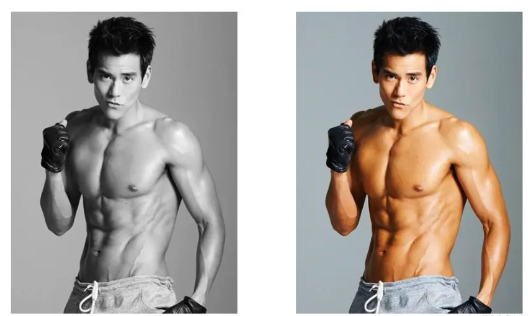
滤镜阴影
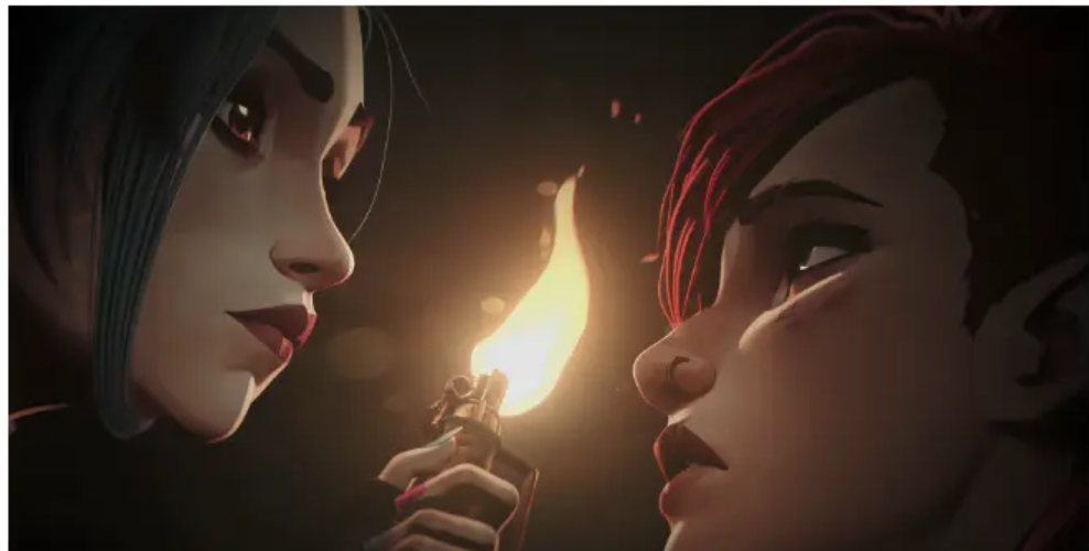
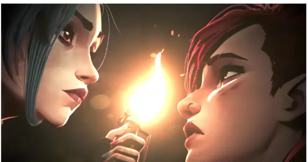
filter: drop-shadow(5px 5px 5px rgba(0,0,0,0.5));box-shadow是设置盒子阴影,但你知道 filter: drop-shadow与box-shadow的区别吗? 举个例子:
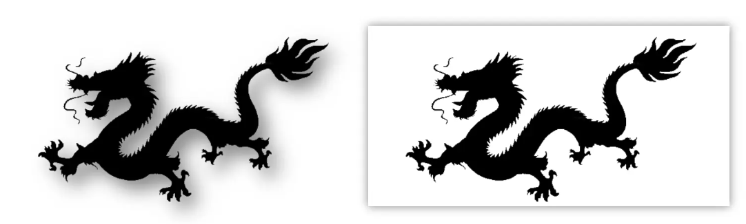
不难看出区别显而易见,但值的注意的是 filter: drop-shadow只针对一张无背景的图片。
图片模糊化
/*数值越高越模糊 */
filter: blur(3px);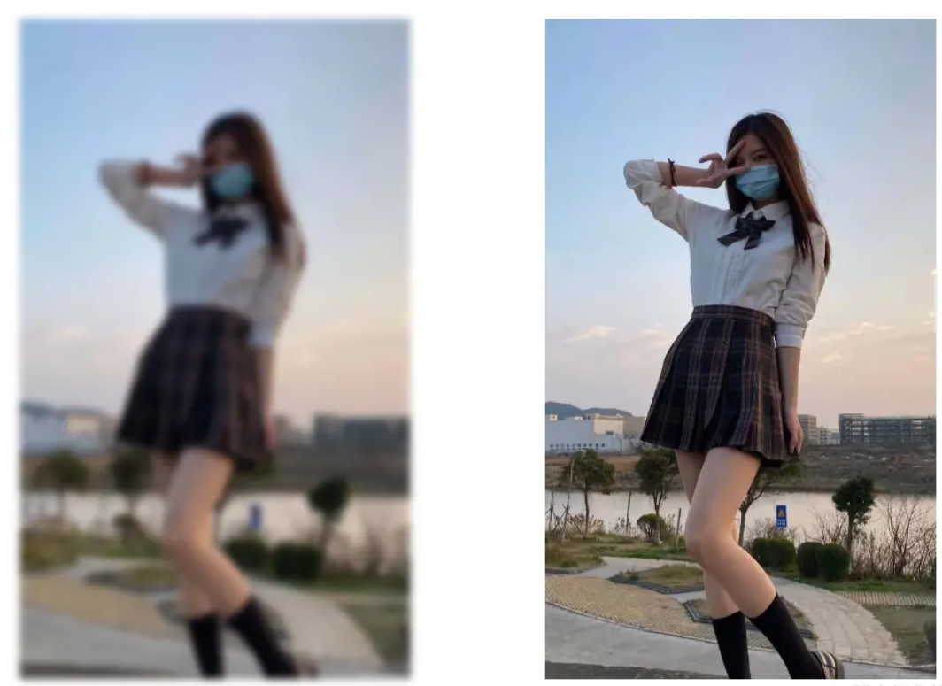
图片亮度调整
filter: brightness(1);brightness() CSS函数将线性乘数应用于输入图像,使其看起来更亮或更暗。
加上属相后的效果:
毛玻璃
backdrop-filter: blur(2px);backdrop-filter 属性可以让你为一个元素后面区域添加图形效果(如模糊或颜色偏移)。因为它适用于元素背后的所有元素,为了看到效果,必须使元素或其背景至少部分透明。
<style>
   .box {
    width: 100vw;
    height: 100vh;
    background-color: gray;
    display: flex;
    align-items: center;
    justify-content: center;
    background: url('./img.png') no-repeat;
    background-size: cover;
  }
  .text {
      width: 200px;
      height: 100px;
      backdrop-filter: blur(2px);
      border-radius: 20px;
      background-color: rgba(0, 0, 0, 0.1);
      box-shadow: 0px 0px 5px rgba(0, 0, 0, 0.9);
      display: flex;
      color: black;
      align-items: center;
      justify-content: center;
    }
</style>

<body>
    <div class="box">
        <div class="text">
            css毛玻璃
        </div>
    </div>
</body>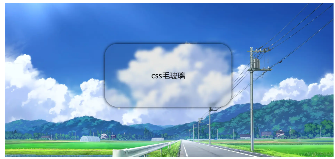
CSS 小案例
图片循环轮播
如下sass代码
<template>
 <div class="swiperContent">
        <div class="picImg">
            <img src="./img/pic1.jpg" alt="">
            <img src="./img/pic2.png" alt="">
            <img src="./img/pic3.png" alt="">
            <img src="./img/pic4.jpg" alt="">
            <img src="./img/pic5.jpg" alt="">
            <img src="./img/pic6.png" alt="">
            <img src="./img/pic7.jpg" alt="">
            <img src="./img/pic8.jpg" alt="">

        </div>
    </div>
</template>
<style scoped lang="scss">
 @keyframes swiper {
        to {
            transform: translateX(-50%);
        }
    }

    .swiperContent {
        width: 80%;
        height: 100vh;
        display: flex;
        overflow: hidden;
        margin: auto;
        mask: linear-gradient(90deg,
                transparent,
                black 10%,
                black 90%,
                transparent);

        .picImg {
            margin: auto;
            /* 撑满就不会出现动画效果的卡顿了 */
            width: max-content;
            display: flex;
            align-items: center;
            animation: swiper 10s linear infinite;

            img {
                width: 260px;
                height: 150px;
                border-radius: 10px;
                margin-right: 40px;
            }

            &:hover {
                animation-play-state: paused;
            }
        }
    }
</style>
扫光
容器扫光
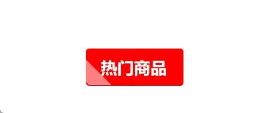
如下sass代码
<template>
  <div class="tips">热门商品</div>
</template>
<style scoped lang="scss">
    @keyframes tip {
        from {
            transform: skewX(45deg) translateX(80px);
        }

        to {
            transform: skewX(45deg) translateX(-10px);
        }
    }

    .tips {
        width: 45px;
        margin-left: 10px;
        background-color: red;
        font-size: 10px;
        padding: 5px 10px;
        font-weight: bold;
        border-radius: 2px;
        color: #fff;
        position: relative;
        overflow: hidden;
        margin: 100px 100px;

        &::before {
            content: "";
            position: absolute;
            top: 0px;
            left: 0px;
            width: 15px;
            height: 100%;
            background-color: rgb(255, 255, 255, 0.5);
            animation: tip 1s linear infinite;
        }
    }
</style>
文字扫光
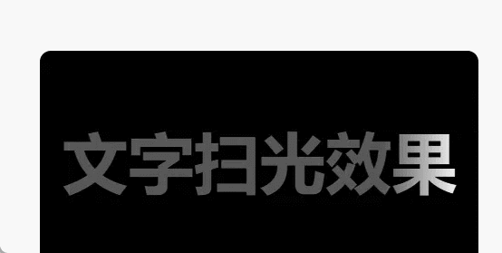
<template>
     <div class="box">
        <span class="tip">文字扫光效果</span>
     </div>
</template>

<style scoped lang="scss">
@keyframes shine {
    from {
        background-position: 0% 0%;
    }

    to {
        background-position: 150% 100%;
    }
}

.box {
    width: 200px;
    height: 100px;
    border-radius: 5px;
    font-weight: bold;
    background-color: black;
    display: flex;
    align-items: center;
    justify-content: center;

    .tip {
        font-size: 30px;
        background: #585757 linear-gradient(to left, transparent, #fff, transparent) no-repeat 0 0;
        background-size: 40% 100%;
        background-clip: text;
        -webkit-background-clip: text;
        color: transparent;
        animation: shine 1s infinite;
    }
}
</style>